/ techniker krankenkasse
employer branding
Design guidelines for the appearance of the employer brand that are based on the brand image and their values.
2022, SYZYGY
My Role: Designer
Team: M. Bürgermeister (Concept)
D. Lammer (ECD)
Tools: Figma
Insight
Techniker Krankenkasse (TK) is one of Germany's largest and most popular public health insurance providers.
The company is built on values of trust, competence, courage, and progress, which should be reflected in its visual identity. To attract innovative target groups such as UX/UI designers and developers, I developed a new brand design concept to differentiate the employer brand from the corporate brand. I also provided the client with examples of how the employer brand could be visually represented in future layouts.
Approach
brand values
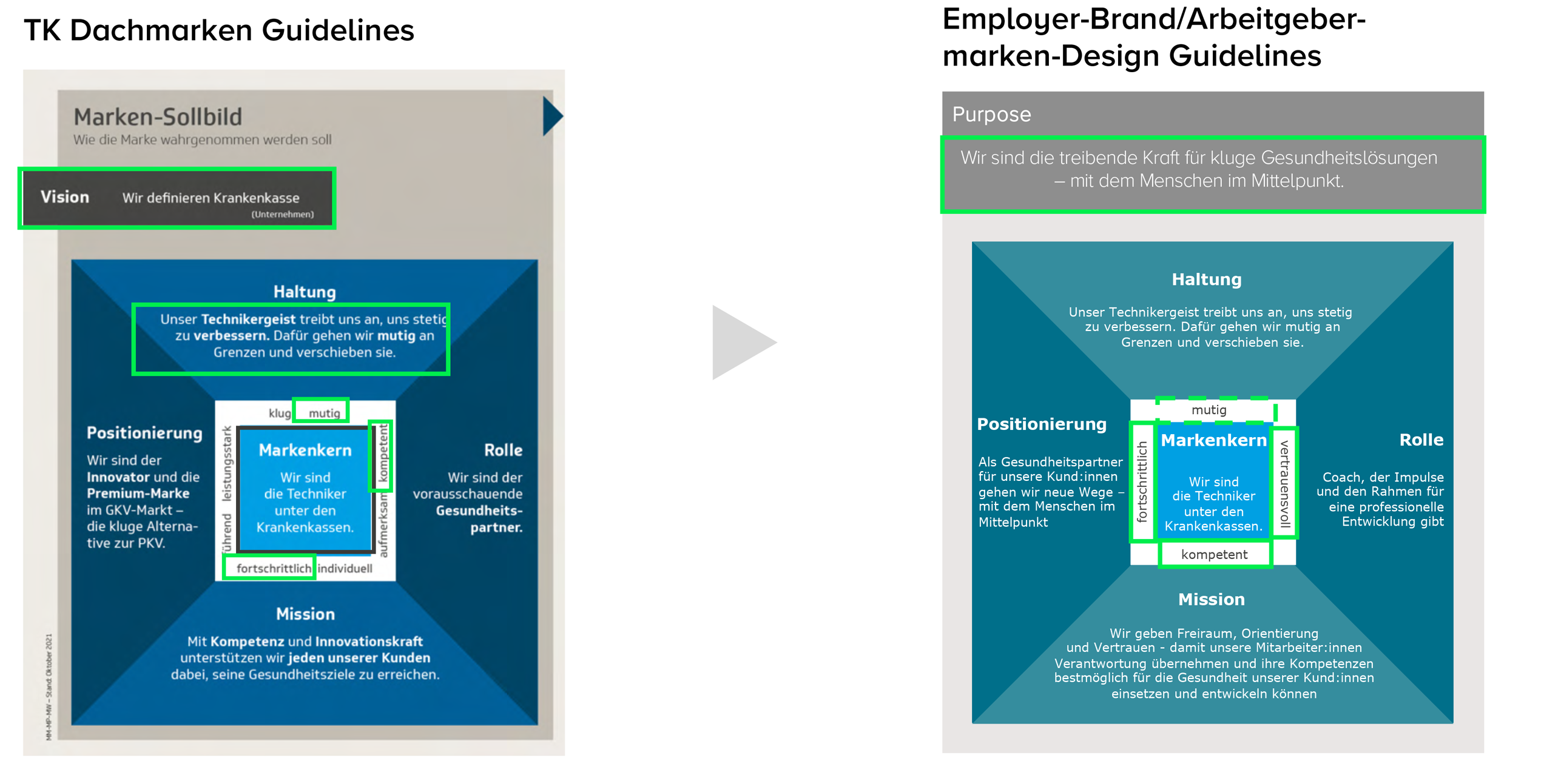
Core values employer brand: brave – progressive – trustworthy – competent
Approach
color iterations
Before integrating the new color 'bordeaux,' I tried to create a new brand feeling with the existing TK colors. Soon it was clear that we need to add another color shade to distinguish the two company segments, but also to reflect their core values.
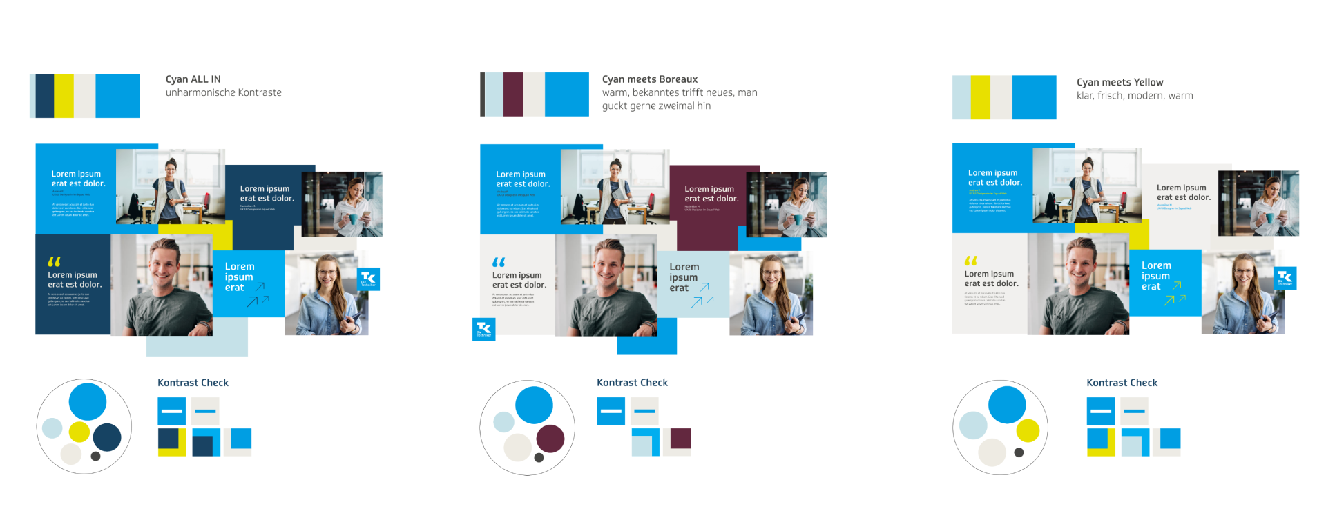
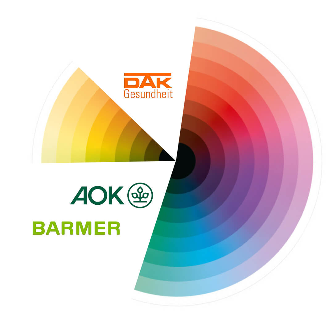
I chose to dive into red tones to distinguish the brand from other
insurances, such as Barmer(green), AOK(green), DAK (orange).
final colors
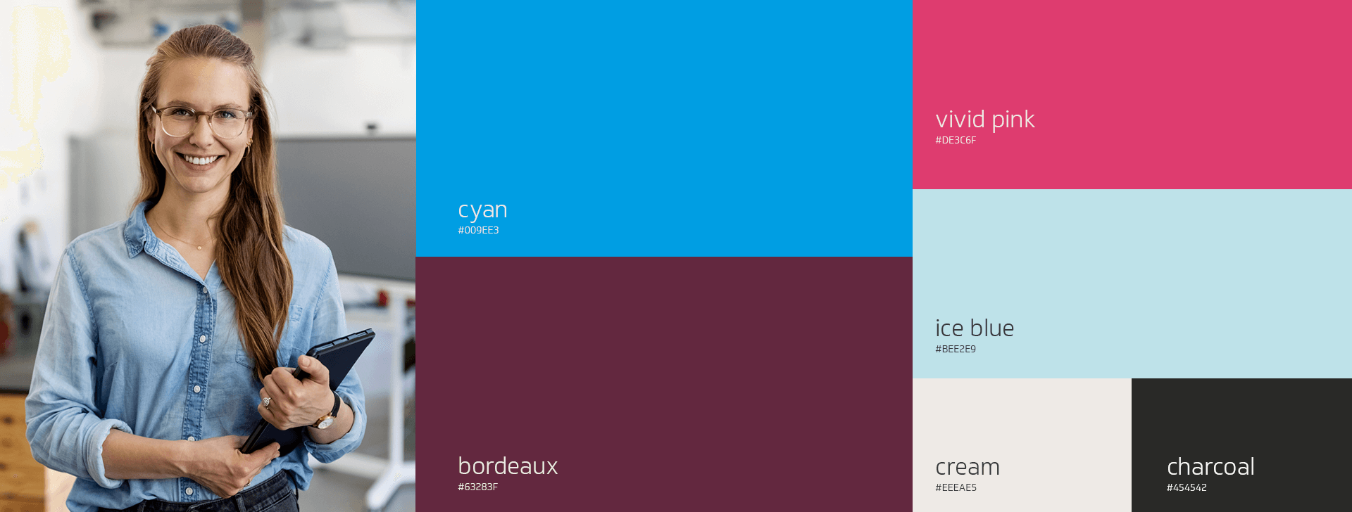
More color and contrast creates a more vivid look. Every color represents one of the brand values.
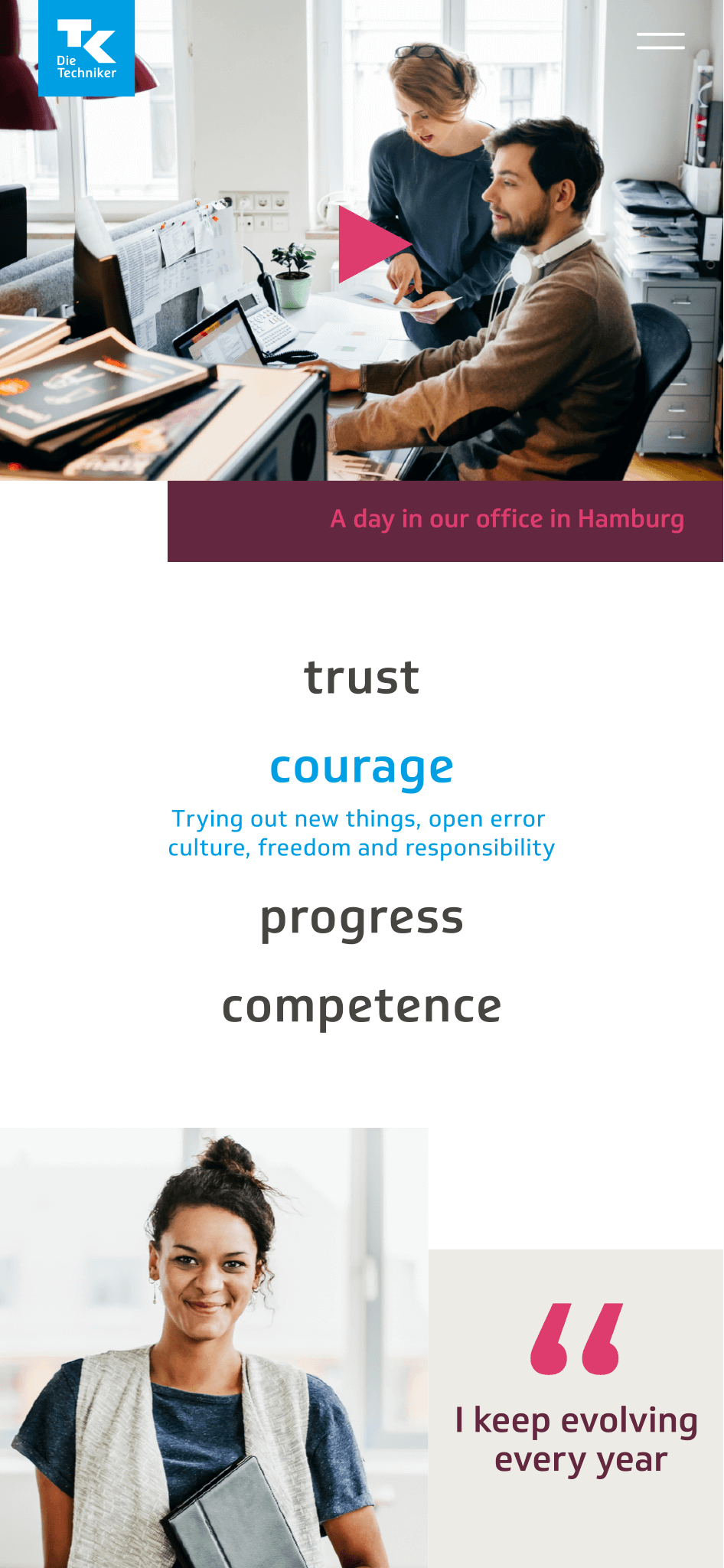
cyan = trust, vivid pink = courage, bordeaux = competence, ice blue = progress
look& feel
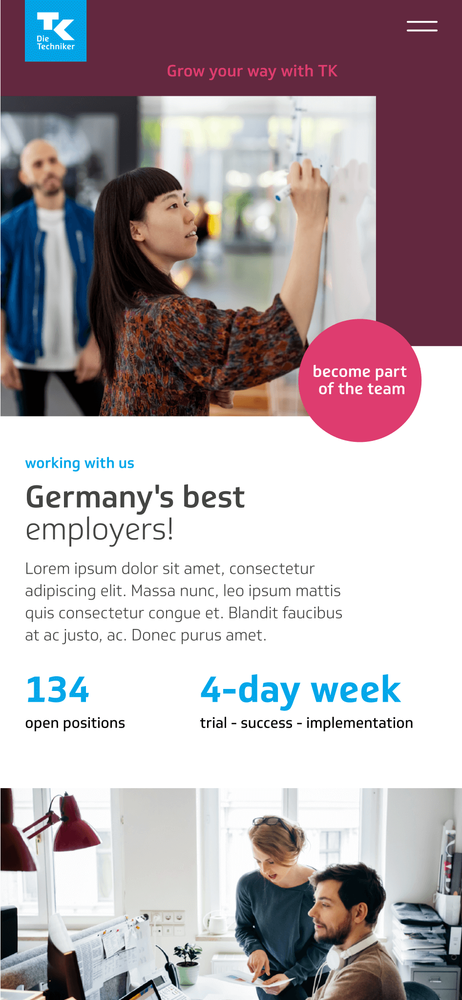
Application examples helped the client to imagine the new look & feel.
imagery
To underline the values of brand's authenticity, I chose realistic images . We want to show real employees and the diversity of the team to create connection.

Impact
TBD

