/ Durex USA - Website Reposition
Website Reposition
Redesign that modernizes durex in the digital space.

2024
My Role: UX/ UI Designer
Creative Design Assignment
Insight
Durex is a globally recognized brand that produces a wide range of products for safe and fun sex. We’re revamping Durex’s e-commerce presence to captivate our 18-25-year-old target audience, aiming to boost brand awareness, user engagement, and sales.
Idea
For this assignment, I first decided to redesign the Durex USA landing page because it is the most visited page and forms the first impression of the website. My main goal was to create a connection and evoke emotions during the shopping journey. Therefore, I aimed to showcase young couples in romantic moments, rather than just displaying products. The interface should be minimal, allowing the products to take center stage.
Outcome
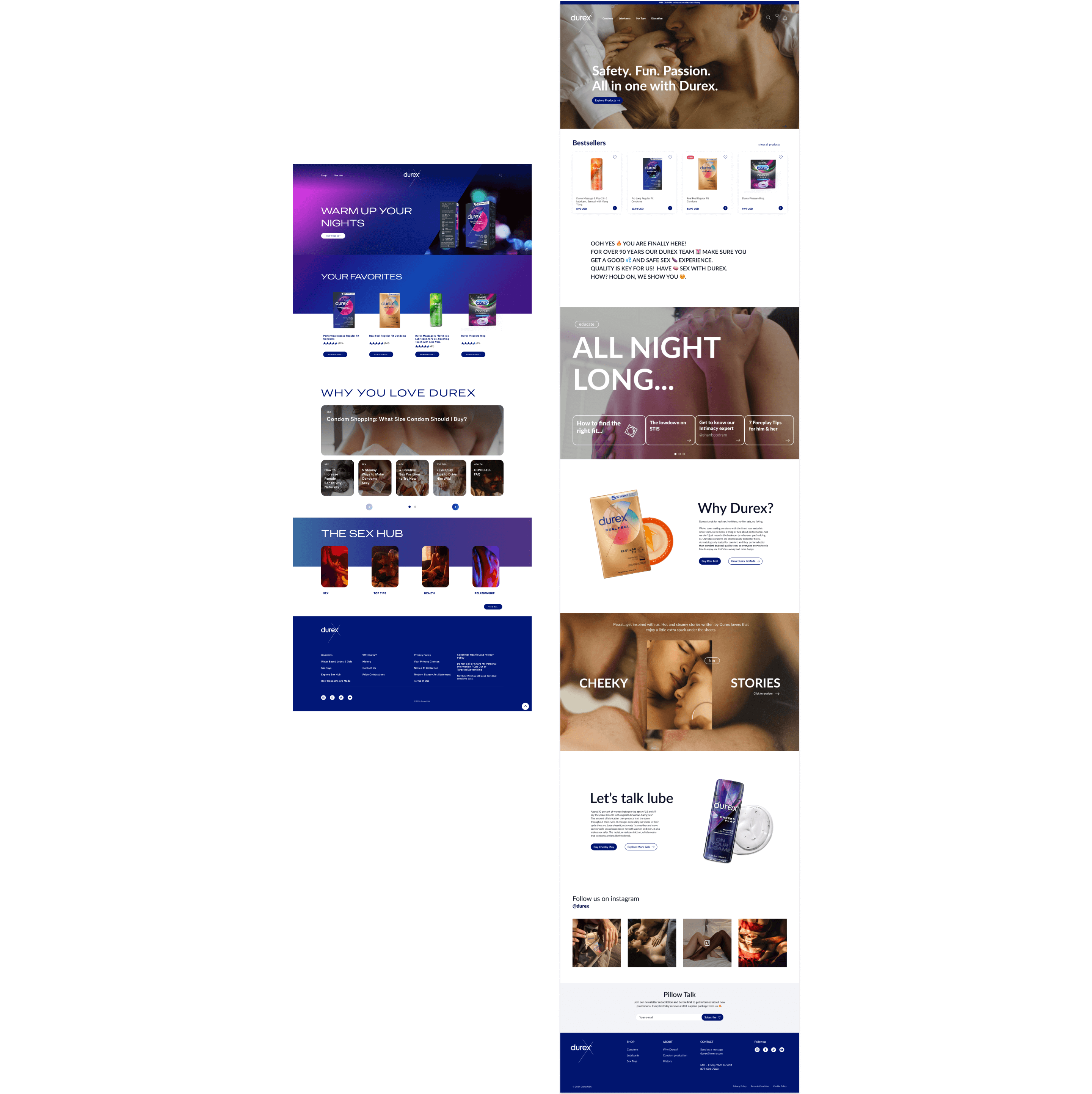
landing page
I began with a benchmarking process to better understand the brand segment. Then, I analyzed the current Durex design, identified pain points, and improved the site architecture, including the top menu and footer. I created a fresh visual concept that resonates with young people and introduced content to help visitors learn about the product range and use Durex products safely and enjoyably. Additionally, I implemented content to encourage users to consistently connect with and engage with the brand.

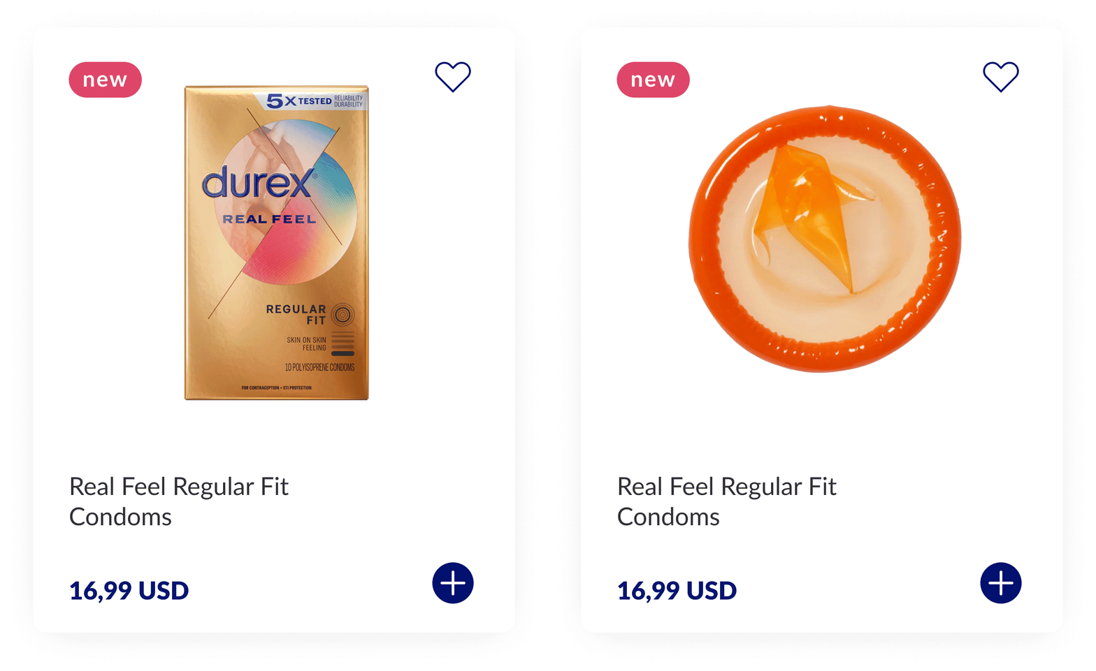
new product tile
Optimized product tile with a hover effect to show product details. Transparent display of product names and prices. Added quick buy option and like function.
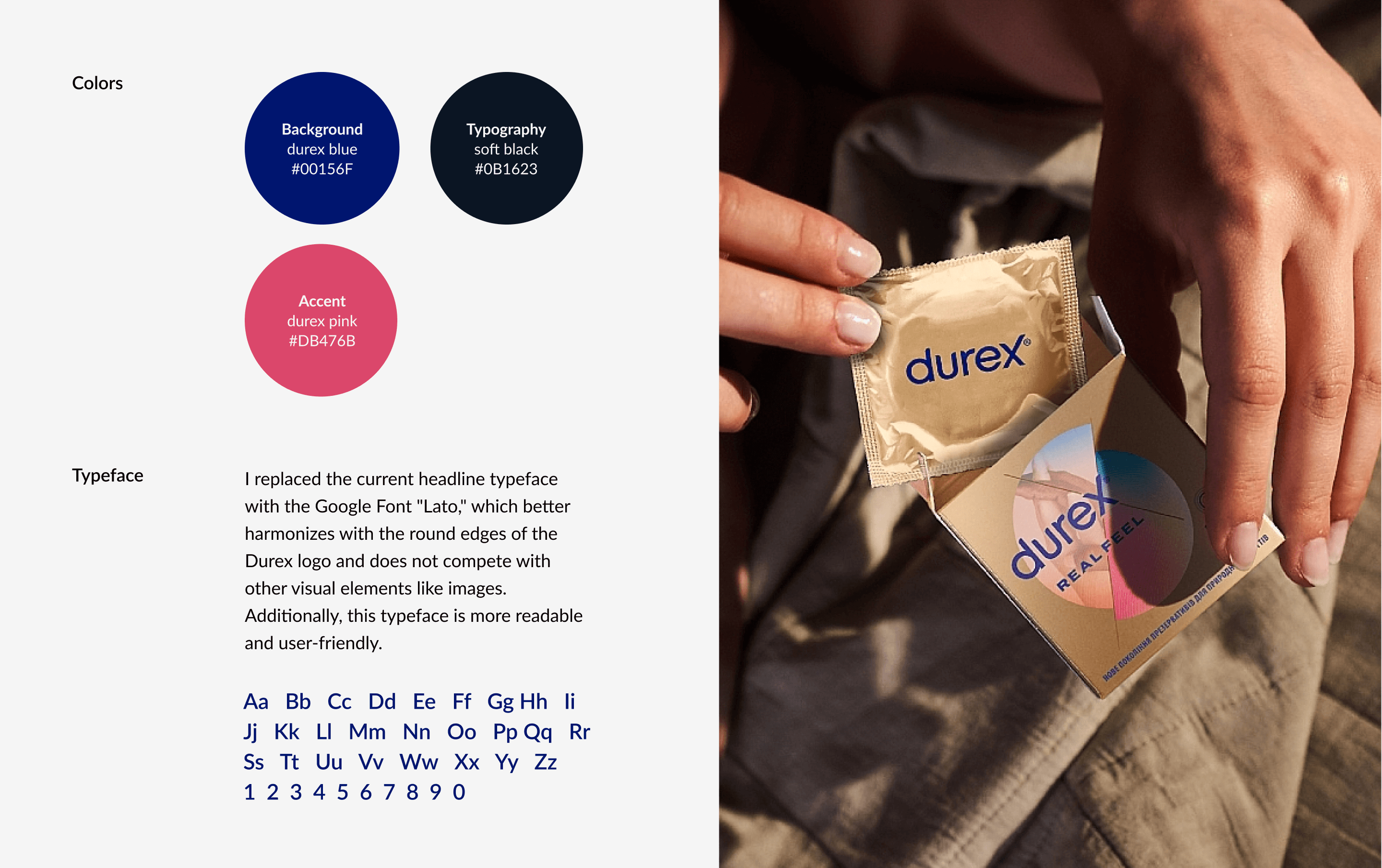
colors & type

before / after

Impact
2 Days, 100% Conviction
finished and presented