/ Miles & More | iF Design Award Winner 2026
Data driven scrollytelling experience
Embark on a personal journey through 2024 together with Miles & More.
2023 – 2024, SYZYGY
My Role: Senior UI-Designer
Team: Katharina K. (Project Manager),
Larissa L. (CD), Sophia B. (Concept), Tatiana Z. (Development)
Tools: Figma, Adobe Ps, Ae
Insight
Miles & More aims to provide all active members with a personalized annual review. This review will celebrate the milestones achieved throughout the year, delivering an emotional user experience that embodies the brand's core values: inspiration, vibrancy, and reward.
"It’s a flagship innovation on our website. I’m incredibly proud of the journey that brought us here and the team spirit that made it possible."
Gerald Schloegl, Managing Director Miles & More
Idea
Building on the success of the "Your Miles & More Year in Review 2022" mailing, the goal is to develop an end-of-year activation designed to deliver a true highlight—both visually and in terms of content.
The aim is to strengthen brand awareness and deepen the connection between the program and all Miles & More user groups.
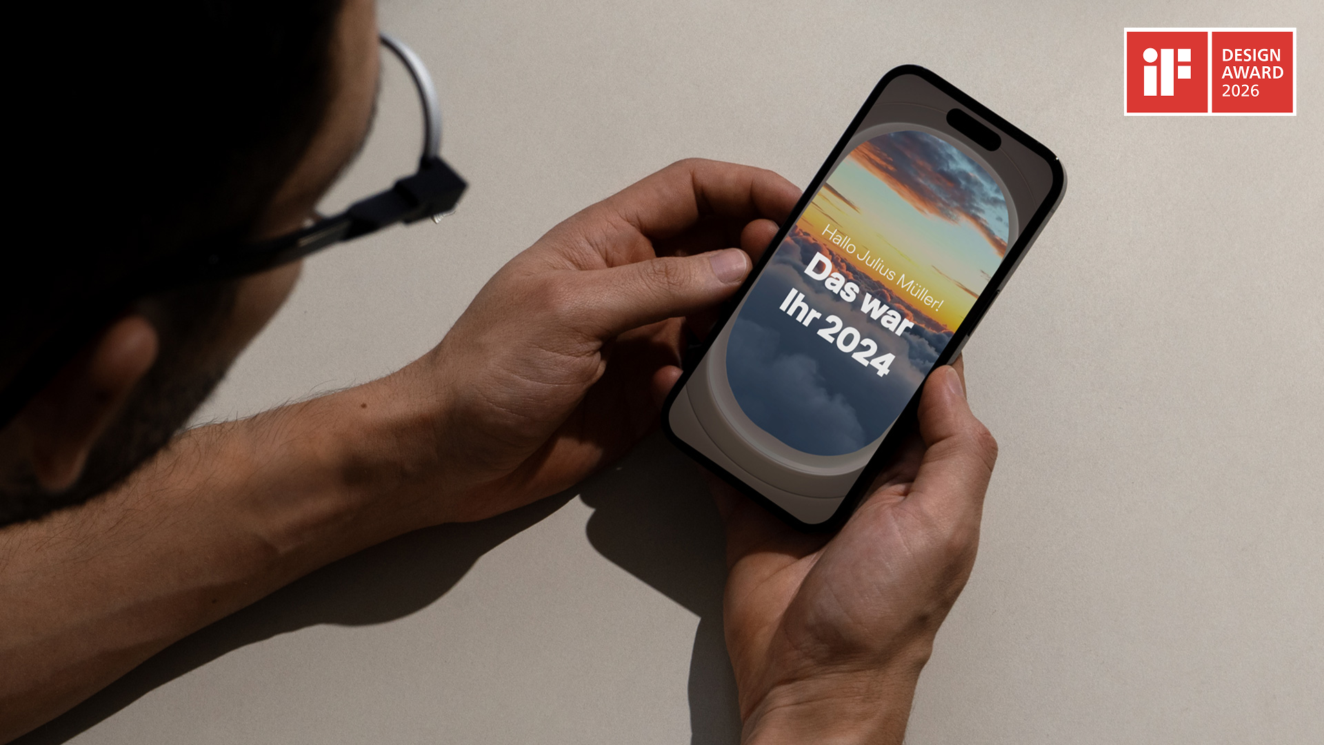
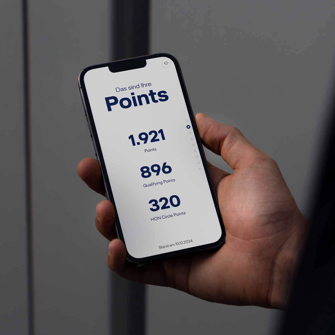
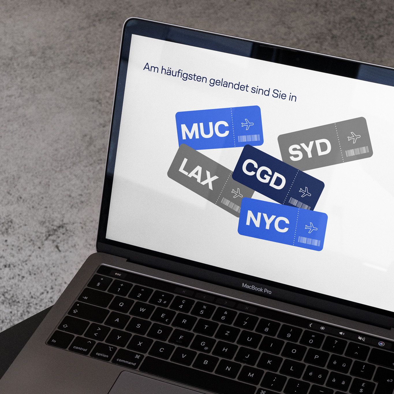
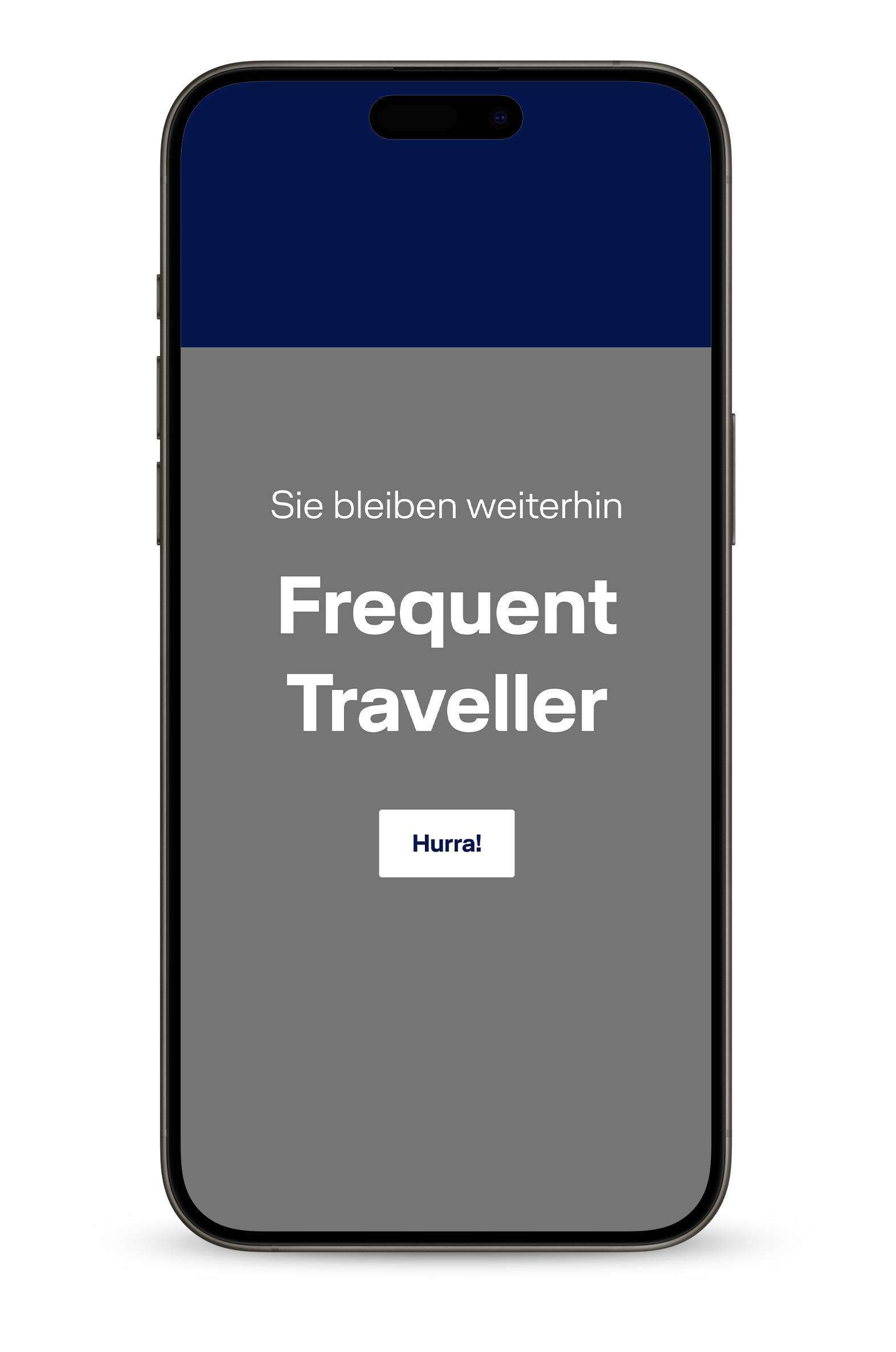
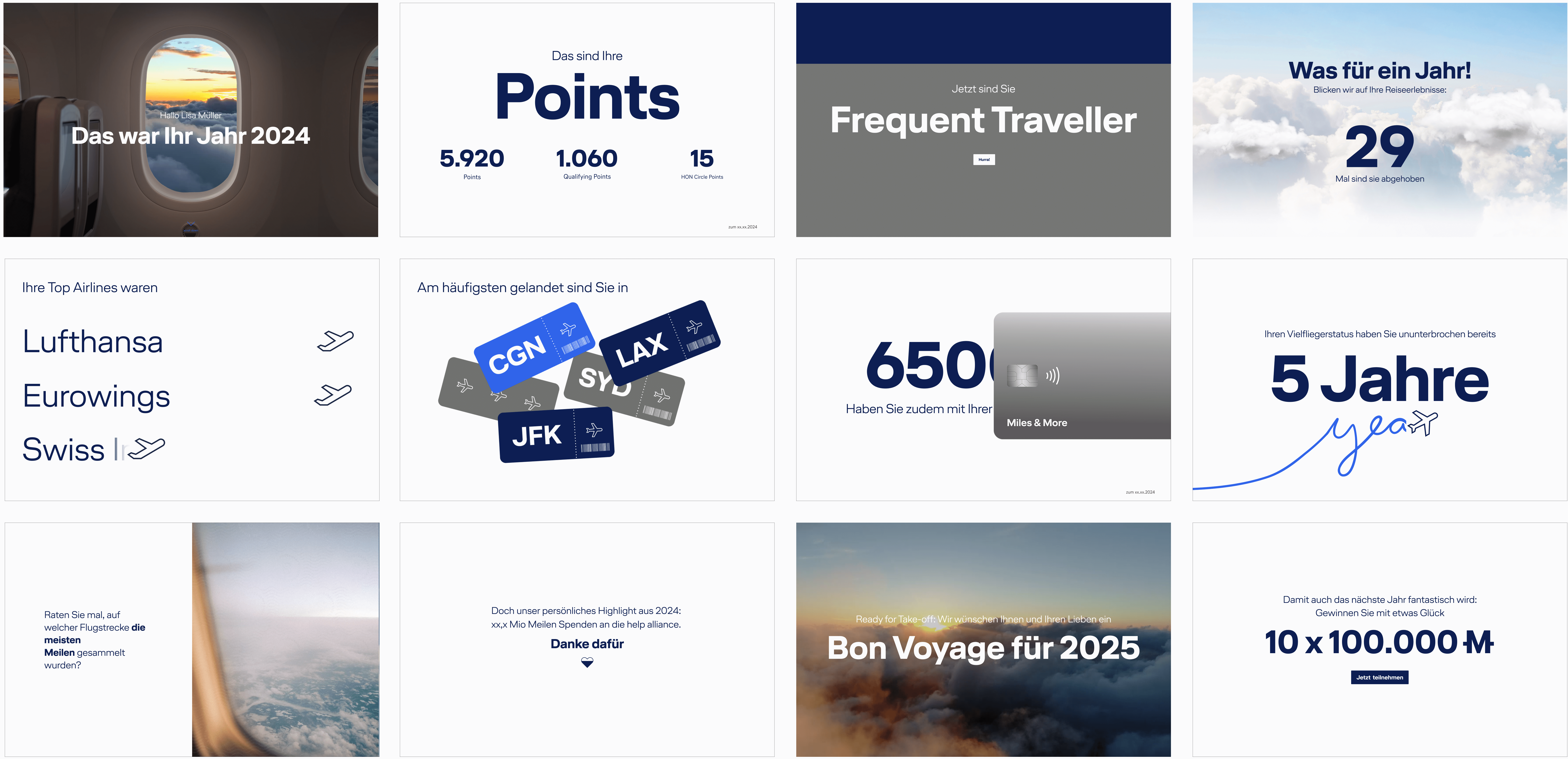
For the first time, we invite members to embark on their personal journey through 2024 with Miles & More on an engaging scrollytelling microsite. This innovative and personalized digital experience is a milestone for the brand and its members. From unforgettable travel moments to achievements in Points, Miles, and status milestones, each member’s journey is unique and worth celebrating.
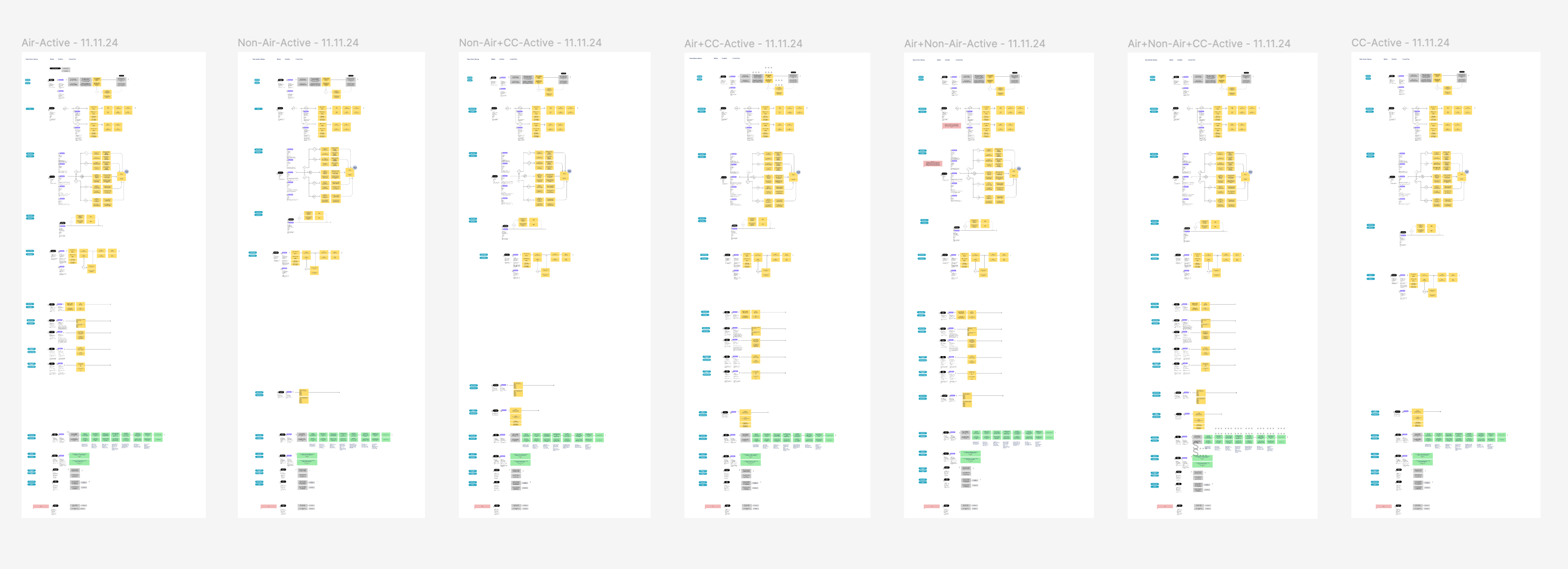
Given the diversity of user groups, each annual review will vary in scope and content. Managing the various data groups and determining how they are displayed presents the project’s greatest challenge.
My Role
In this project, I took full ownership of the visual concept, starting with in-depth visual research that informed the design of the modules. I also ensured their seamless animation and integration within the scrollytelling site, creating a cohesive and engaging user experience.
Approach
User Flows
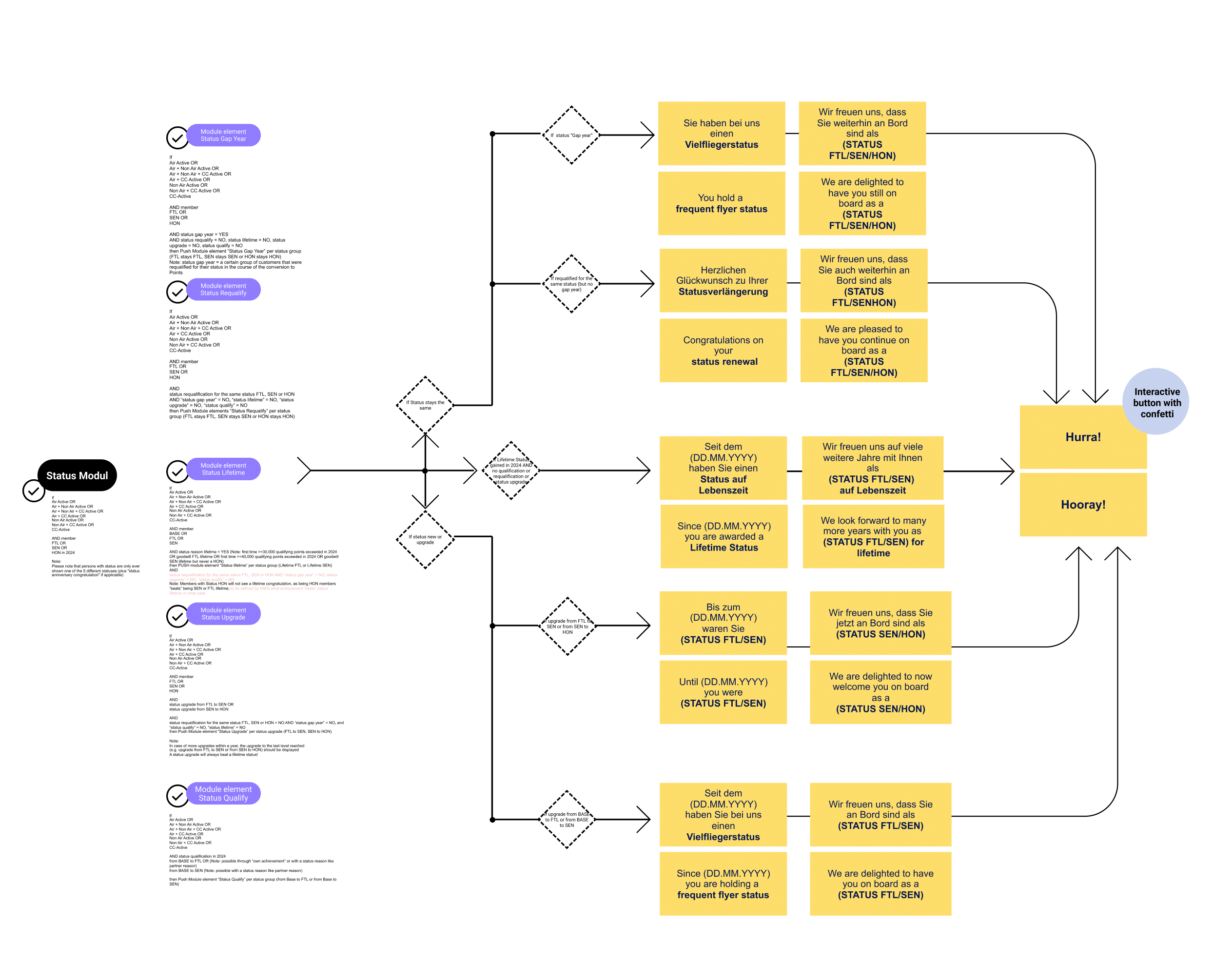
We successfully created a unique experience for all seven user flows. Each flow highlights a different activity within the Miles & More program. To maintain flexibility in the user flows, we decided to build the website using modules that can be arranged in different orders. Each module summarizes a specific category, such as collected miles.
Design Concept
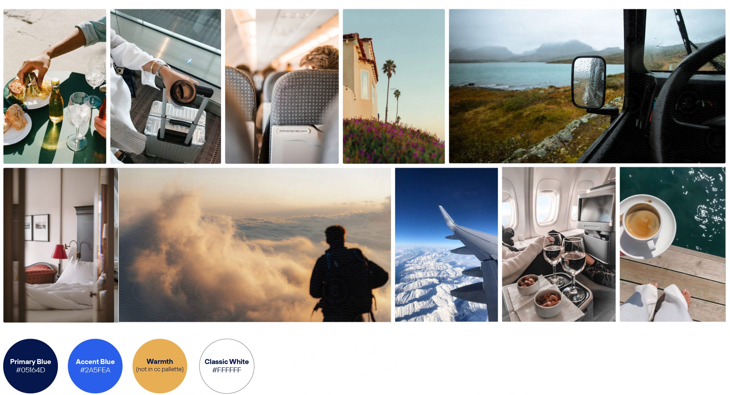
I aimed for the visual concept to feel authentic, raw, warm, and documentary-like.
The visuals capture the members' personal perspectives, with cropped objects and no full body shots. Emotion emerges through thoughtful lighting and intimate angles. The image colors seamlessly align with the Miles & More brand palette.
The entire scrollytelling microsite is built around 12 flexible modules, each representing a unique category. I proposed the idea of using modular design to accommodate the personalized storylines of each member. Most modules feature generous whitespace and softened edges, ensuring smooth transitions between sections.
Outcome
Full storyline
What makes this year in review so special? It’s not just about looking back. With an entertaining scrollytelling microsite, we’ve created a truly personalised experience.

Impact
Mailing Sent: 3.1 million
E-mail Open Rate: >83%
Click Rate: >55%
Time spent: 2,4 minutes
2,5 page views per user on average
let's work together
mail@n-diseno.com
All rights reserved © 2026